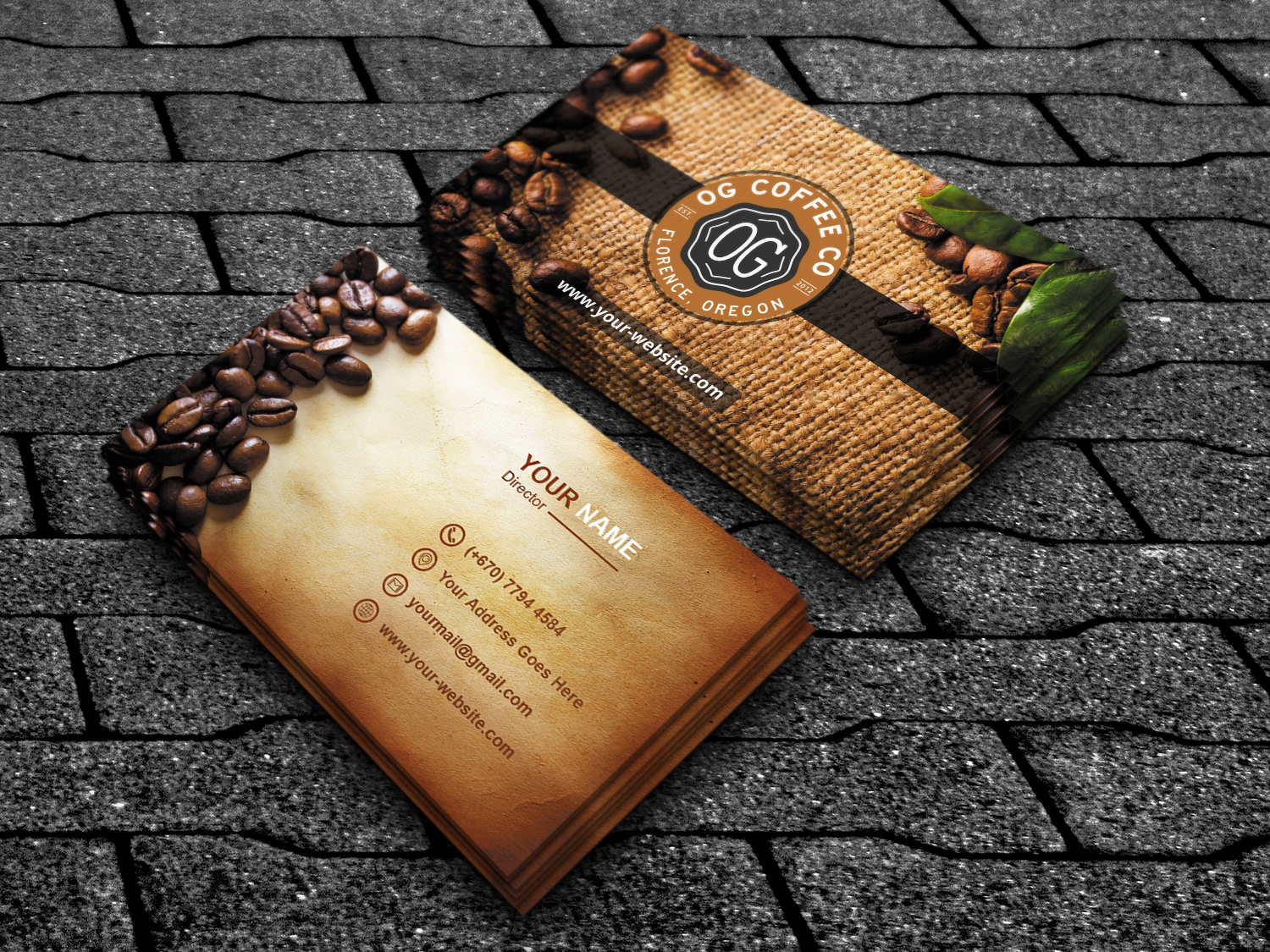
Ever handed someone a business card at a bustling networking event, only to wonder if it was impactful enough to be remembered? Consider this: research suggests that we form a first impression within 17 milliseconds of seeing something. That’s less time than it takes for a hummingbird to flap its wings once! In such a fleeting moment, your business card needs to not just catch the eye but hold the gaze. It’s not just a piece of paper; it’s a canvas of your professional identity.
Crafting Your Personal Brand
The journey of creating a memorable business card starts with your personal brand. What colors represent your professional persona? Is your industry conservative or creative? The answers to these questions should guide the design elements like color scheme and typography. Imagine a lawyer using neon colors on a card; it doesn’t quite fit, right? Instead, a subtle navy blue might convey the seriousness and professionalism expected in legal fields.
On the flip side, if you’re a graphic designer, the card is your mini-portfolio. A splash of creativity not only shows your skill but also sets a memorable precedent. Perhaps, include a unique illustration or a quirky design that sparks conversation. It’s about balancing professionalism with personality.
Typography That Talks
Typography is a silent communicator. The fonts you choose can speak volumes before a word is read. For instance, a strong, bold font like Helvetica can project authority and stability, while something more whimsical like Comic Sans (use with caution!) might suggest approachability and fun. The key is coherence with your industry’s expectations and your brand’s voice. It’s not just what the words say, but how they appear that can affect perceptions.
Consider also the font size and spacing. Overcrowding your card with tiny, unreadable text is a common pitfall. Instead, opt for clarity and simplicity. Allow your name and essential contact info to breathe with generous spacing, making it easy for new connections to reach out.
Material Matters
While the design captures the initial attention, the material of your business card holds it. Imagine receiving a card that feels flimsy and cheap—it doesn’t exactly scream ‘trustworthy’ or ‘high-quality.’ Therefore, selecting the right paper stock or alternative material is crucial. A thick, textured cardstock can add a layer of luxury and substance to your presentation. For a more modern, innovative vibe, materials like metal, plastic, or even wood can make your card stand out in a pile and reflect a cutting-edge professional identity.
Additionally, consider the finish of your card. A matte finish can offer a sophisticated, understated look, while a glossy finish might bring out vibrant colors and make details pop. For those looking to make a more tactile impression, options like embossing or foil stamping can provide a memorable touch that visually and physically stands out.
Maximizing the Message
What you choose to include on your business card says a lot about what you value as a professional. It’s tempting to cram as much information as possible—email, phone number, social media handles, a mini-resume—but this can lead to a cluttered design that dilutes the impact of your card. Instead, focus on what’s essential. Ensure your name, title, and contact information are prominent and easy to find.
For a modern twist, consider adding a QR code that links directly to your professional online profile or portfolio. This not only keeps the card clean and uncluttered but also harnesses the power of digital convenience, allowing new contacts to connect with you and learn more about your work with just a simple scan.
Remember, the goal of your business card is not to provide a biography but to create an engaging introduction that encourages further interaction. Each element from design to content should be thoughtfully curated to build interest and invite deeper conversation.
Consistency is Key
Ensuring consistency across all your branding materials strengthens your professional image and aids in building brand recognition. Your business card should be a reflection of your broader branding strategy. If your website features a minimalist design with cool tones, your business card should follow suit. This creates a cohesive experience for anyone interacting with any aspect of your brand, from digital to physical. Consistency helps to forge a stronger connection and makes your professional identity more memorable.
Moreover, consistency goes beyond visuals. The tone and language used on your business card should match your other marketing materials. If you’re known for a conversational and approachable tone online, echoing this style on your card can make your brand feel more authentic and relatable.
The Power of a Creative Call to Action
While business cards serve the primary function of sharing contact information, they can also be a powerful tool for motivating further engagement. Instead of ending with just your contact details, why not include a creative call to action? This could be an invitation to schedule a consultation, a prompt to visit your website for helpful resources, or even a small puzzle or riddle that reflects your industry expertise, encouraging the recipient to engage with your brand on a deeper level.
Such interactive elements can transform your business card from a static piece of information into an active participant in your networking efforts. It’s about leaving a lasting impression that keeps you and your business at the forefront of potential clients’ or partners’ minds.
Conclusion
In the fast-paced world of professional networking, your business card is more than just a tool—it’s your introduction, your brand in a pocket, and your opportunity to make a lasting impression. With thoughtful design, high-quality materials, and a clear message, your business card can open doors to new opportunities and set the stage for valuable connections. Remember, it’s not just about what you present, but how you present it that counts.
So, what will your business card say about you?


