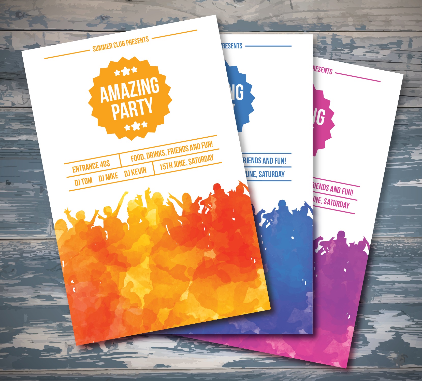
Ever received a pamphlet that made you stop and read? There’s an art to crafting one that catches the eye and delivers its message effectively. In a world where digital media dominates, the tactile charm of a well-designed pamphlet can make a memorable impact. Yet, designing an effective pamphlet involves more than just putting information on a piece of paper. It requires strategic planning, creative design, and a clear understanding of the intended audience.
Understanding Your Audience
Before a single pixel is placed, knowing who will receive the pamphlet is crucial. Are they young tech-savvy individuals or perhaps older, less digital-oriented folks? The design and content should resonate on a personal level with the audience. This means choosing images that reflect the demographics’ lifestyle and writing in a tone that speaks directly to them.
Clarity in Message
What is the main message or action you want the reader to take from your pamphlet? Whether it’s attending an event, visiting a website, or making a purchase, the call to action must be clear and compelling. Use bold headings and bullet points to make key information stand out and ensure that the pamphlet’s purpose is unmistakable from the get-go.
Visually Appealing Design
A visually striking design can make the difference between a pamphlet that’s read and one that’s ignored. Utilize color psychology to evoke certain emotions or actions. For instance, blue can convey trust and dependability, while yellow might evoke energy and optimism. Balancing images and text ensures the pamphlet is not overwhelming but rather inviting and easy to navigate.
Consistency in Branding
As pamphlets are often a part of larger marketing campaigns, maintaining consistency in branding is essential. This includes using consistent fonts, colors, and logo placements that align with the brand’s identity across all platforms. This not only reinforces brand recognition but also enhances professional credibility. Imagine a pamphlet that feels like a natural extension of your website or storefront; this continuity makes your message more persuasive and cohesive.
Engaging Content
While design catches the eye, content captures the mind. Effective pamphlets should tell a story that engages the reader. This could be through compelling facts, interesting anecdotes, or relevant statistics that underscore the pamphlet’s message. Also, consider the power of questions to provoke thought, such as ‘What if you could change your life in a day?’ Such questions can make the content more interactive and personal.
Strategic Use of Space
Space in pamphlet design is not just about what you add, but also what you choose not to include. A cluttered pamphlet can be overwhelming and off-putting. Use white space strategically to help important elements of the pamphlet — like headlines, logos, and calls to action — stand out. The layout should guide the reader naturally through the content, leading them seamlessly from introduction to conclusion.
Quality Printing and Materials
The physical quality of the pamphlet reflects on your brand. Choosing the right paper and printing options can greatly influence how the pamphlet is perceived. Glossy finishes can make colors pop and are great for image-heavy designs, while a matte finish might be more suitable for a text-heavy, professional approach. Also, the weight of the paper can convey a sense of quality and importance.
Testing and Feedback
Before finalizing your pamphlet, it’s crucial to test its effectiveness. Share drafts with colleagues, friends, or a focus group that matches your target audience. Gather feedback on the design, message clarity, and overall appeal. This step can unveil insights that might be overlooked by the design team and can lead to crucial tweaks that enhance the pamphlet’s impact.
Digital Integration
In today’s digital age, consider how your pamphlet can integrate with online elements. For instance, including QR codes that link to a video about your product or service can bridge the gap between physical and digital marketing. This not only enhances user engagement but also allows tracking of how effective the pamphlet is in driving online traffic.
Call to Action
Every effective pamphlet must end with a strong call to action (CTA). What do you want the reader to do next? Whether it’s visiting a website, making a phone call, or visiting a store, make the CTA clear and easy to follow. Use imperative verbs like ‘Visit,’ ‘Call,’ or ‘Discover’ to create a sense of urgency and encourage immediate action.
Reflection on Impact
Pamphlets are not just about providing information; they are a tool for making a real impact. Whether informing, persuading, or entertaining, the ultimate goal is to leave a lasting impression on the reader. By focusing on the audience, maintaining brand consistency, and crafting a compelling narrative with high-quality materials, your pamphlet can become an influential part of your marketing toolkit.
In a world blooming with countless digital messages every day, a well-crafted pamphlet stands out as a tangible piece of your brand’s story. So, ask yourself, what story do you want your pamphlet to tell?


